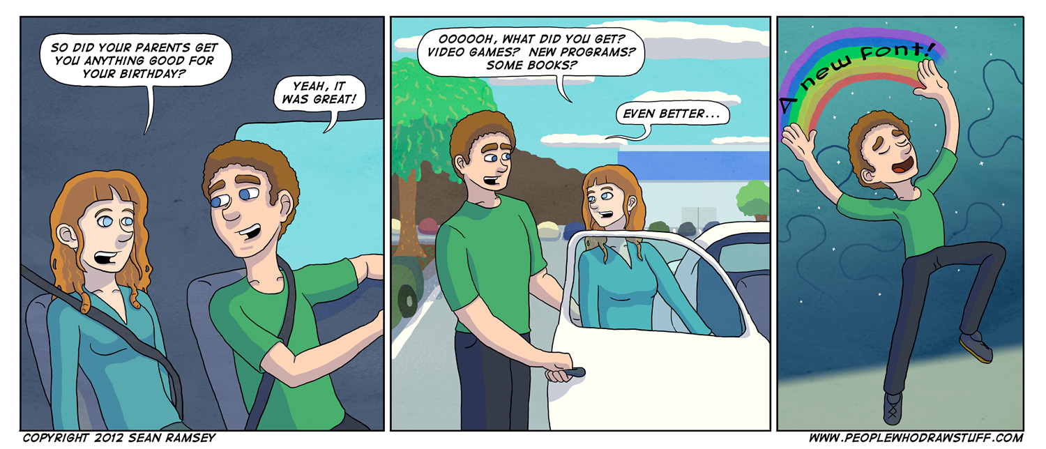
A Whole New World
I’ve never been particularly obsessed with the way type looked. How dainty or strong the cross stroke or brackets are. The curves of the shoulder or swash. The perfect angle of a letterform’s stress.
What? I took Typography in college and have never once used any of that type-vocab out of a classroom. I gotta get while the gettin’s good!
Ok, I do care a bit but not to the extreme that so many graphic designers do. What I do obsess over is the literary value of a font. The fact that I can intone the writing with inflections with a bold or italic stroke. Giving myself more versatile writing tools as well as having a font that has capital letters and lowercase makes me feel more comfortable. See what I did there?
I think I am kind of akin to Art Spiegelman (author of Maus) in that I see comics as literature with imagery instead of pictures with words attached (see, I even said author instead of artist). There are so many possibilities it hurts my brain. My estimates are that more than 80% of people who come to this site read the comic and go on their way without even glancing at these little micro-essays that accompany the images above, but you know what? That’s ok. Putting these thoughts and concepts down digitally is training my writing skills just as much as putting down pretty pictures trains my artistic skills.
Then again, you could all be coming here with the sole purpose of reading these musings and give not two thoughts about the comics above. Really, I can’t track that until I implant retinal scanners in all of your eyes so we’ll just have to wait.
-Sean

Wait……OMG THERES PICTURES!!!!!!!!!!!!!!!!!!!!!!!!
HOW DID I NEVER SCROLL UP???????
And for that matter how would a page load not at the top but at the middle?
Hm…something to ponder….
Haha, I knew there was someone out there missing out. The web is as mysterious as it is vast and full of tubes.